Illuminated Letters for the Web
Before they started churning out slop in Gutenberg,1 books were not "content." They were objects: labor-intensive, expensive, and meant to be treasured. Medieval manuscripts existed for patrons with wealth, patience, and taste. And you only copied a manuscript that was really, really important. So they didn't just write books. They adorned them.
I admire that. The medieval aesthetic is vibrant, saturated, and self-confident, an era that feels oriented toward individuals and God, rather than institutions and abstractions. At Harvard I especially enjoyed studying Timurid illuminated manuscripts under David Roxburgh (Prince Alwaleed Bin Talal Professor of Islamic Art History), and the fascination never really left me.
Part of what draws me in is that the medieval world isn’t a “prototype” of modernity. It’s its own civilization: its own logic, its own visual grammar, its own spiritual temperature. Since it stands apart, it makes modernity feel uncomfortable rather than superior. And we really ought to disabuse modernity of any pretensions to finality. It’s just another passing period, with problems it can’t solve without betraying itself. Get back in your cage, Fukuyama!
Building the Font
When I redesigned this site, I wanted to smuggle a bit of that medieval spirit onto the web, for the sake of beauty rather than utility.
The technical question was straightforward but annoying: how do you render detailed, colorful artwork as text? You want something that behaves like a real character, responds to CSS, sits on the baseline, and can be swapped in with ::first-letter.
The answer is color fonts. Traditional fonts store vector outlines. Color fonts can embed images per-glyph. There are a couple major ecosystems: Apple’s sbix format (common on macOS/iOS, including many emoji fonts) and Google’s CBDT/CBLC tables (common in Chrome/Android). If you want this to work across browsers, you end up caring about both.
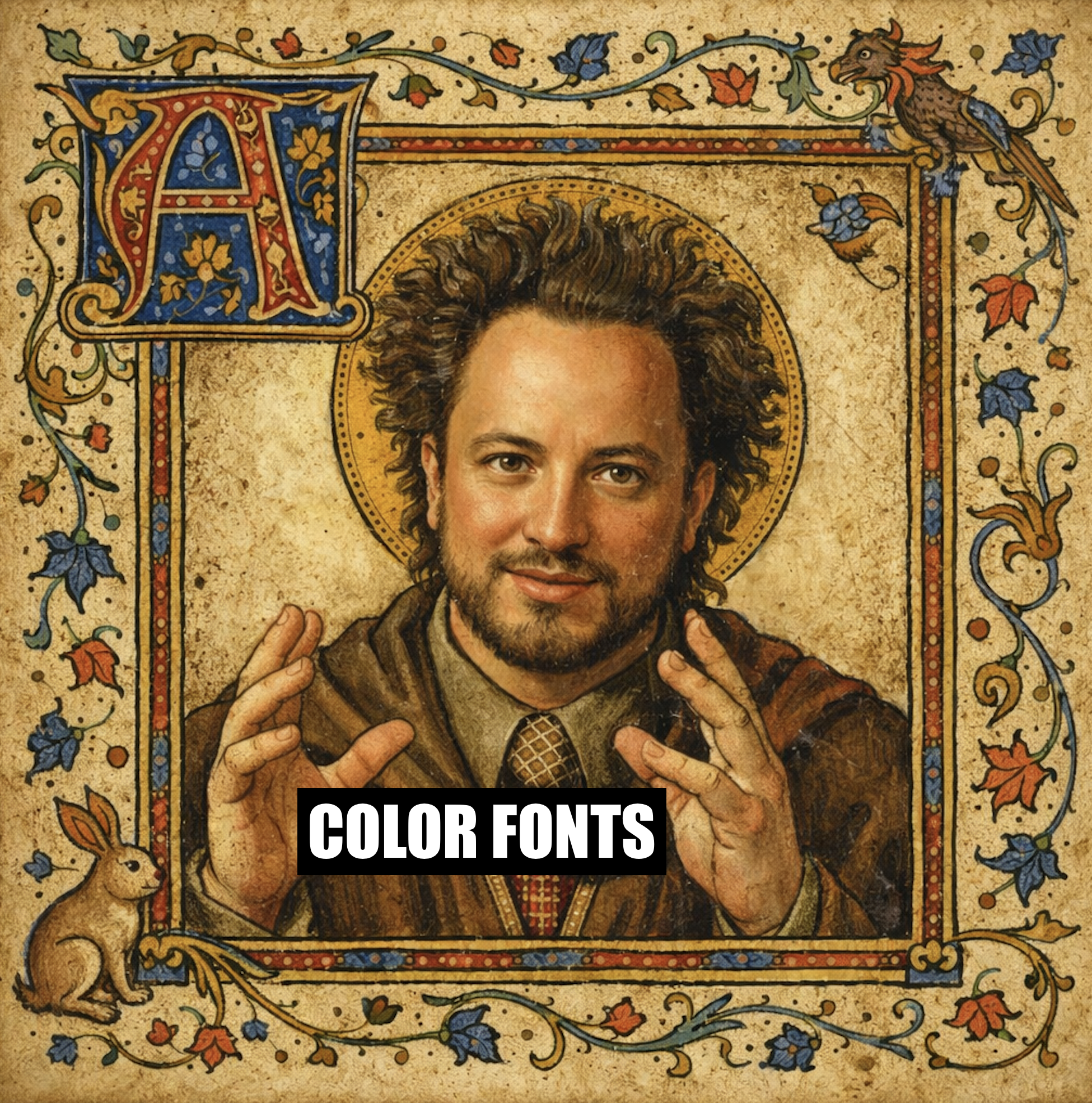
I started by generating illuminated initials with OpenAI DALL-E. Here was my prompt:
A medieval illuminated manuscript capital letter '{letter}', ornate with gold leaf, intricate floral patterns, vines, and decorative borders in the style of the Book of Kells or a 15th century French illuminated manuscript. Rich colors of deep blue, burgundy, and gold. The letter should be centered on a plain white background for easy extraction. High detail, professional quality.
After cleanup (background removal, consistent framing, etc.), I used Python and fontTools to assemble a font containing the 26 capital letters at multiple resolutions.
The first version worked beautifully in Safari and failed silently in Chrome—classic. My handcrafted CBDT tables were almost right, but not right enough. The fix was counterintuitive: build the full font first, then let fontTools do what it does best—subsetting.
Now each capital letter is its own ~1MB WOFF2 file, and it’s loaded on demand using CSS unicode-range. Your browser only downloads the letter it actually needs for that page. If a post begins with “T,” you download “T.” Nothing else.
On Treating Ideas with Respect
There is no practical reason for illuminated drop caps. They don’t improve readability. They definitely do not improve performance. My original TTF file was 28MB; may the Mobile user beware! No, this endeavor was a crusade for pure ornament, an anachronistic flourish on an otherwise minimal site. Is it frivolous? Perhaps. But that objection is worth examining.
Modernity often sees beauty as frivolity. Yet in the medieval imagination, ornament has function. It is attestation: a declaration that something is worthy of attention, and therefore worthy of labor. You gild what you mean to keep. In the world of medieval manuscripts, this applies intellectually too: beautiful ideas deserve beautiful presentation.
That sensibility predates the medieval. Plato would say that beauty is not an optional garnish on truth; it is one of truth’s modes of appearance. Beauty is a way order becomes perceptible to creatures like us. Not exactly proof, more like evidence of orientation: when a mind is turned toward what is real, it starts to make things with proportion, harmony, and care.
And yes, by that standard, ugliness can be diagnostic. Not that ugly things are false, but that habitual ugliness is often a confession: mediocrity, impatience, or the nagging doubt that a culture’s ideas lack meaning.
Which is why I wanted illuminated letters on the web. Not because they’re useful, but because they’re an assertion: this is not content; these are ideas I like. I ought to give them a pretty home.
You might also like:
- The Faery Prince; or, Why There Is a Door to Eden · On beauty without morality, and why aesthetic sensitivity alone is not enough.
- The Greatest Film of All Time · A frame-by-frame decoding of Parajanov’s The Color of Pomegranates as visual language.
Footnotes
-
We're not discussing the Bible here. Fittingly, Gutenberg began by printing indulgence forms—single-sheet "fill in the blanks" documents sold by the Church. The 31-line Indulgence, with surviving copies dated October 22, 1454, is often cited as the earliest precisely dated Gutenberg printing.2 Talk about slop! ↩
-
Janet Ing, "The Mainz Indulgences of 1454/5: A Review of Recent Scholarship," British Library Journal 9 (1983): 14–31. See also Princeton's Scheide Library copy, issued to Margaretha Kremer and her son Johann in Erfurt. ↩